Color Theory
“Color! What a deep and mysterious language, the language of dreams.”
— Paul Gauguin
Color! Mention this word along with mixing and watch even some of the most seasoned artists run away screaming, especially in our modern world where artists can buy hundreds of tints and tones pre-mixed for their convenience. Keep in mind that this convenience is supposed to be a good thing, and while it undoubtably is for paint manufacturers and their profits, I cannot help but wonder whether the same can be said for those buying the paints and inks.
Admittedly, mixing colors can be a difficult task, a seemingly insurmountable obstacle to what an artist naturally wants to do — which is to create. Yet, the convenience of pre-mixed colors can create obstacles of its own, as I found out during my second trip to Italy. I had purchased a set of professional-grade watercolors before my trip and was looking forward to using them. At this point in time, I was focused on using bright colors, the brighter the better (or so I thought) since they could always be dulled down (or so I thought).
As bright as the colors were, however, they just didn't feel right when I used them in my paintings of Pari. As a medieval town whose buildings are made up of intricate stonework, there are an abundance of earth tones. Even the plants, particularly the cypress and the olive trees, take on a more muted cast. These realizations caused me to question my choice of colors and begin searching for alternatives.
I reasoned that if one wanted to paint portaits of the Italian landscape, then it only made sense to use Italian colors. After a fair bit of searching, I came across the MaimeriBlu line of watercolors, which had recently been remastered with modern materials. Not only were these paints professional-grade, but their tubes were inexpensive as well, so I decided to give them a try. And I'm glad that I did, for that simple decision completely changed my approach to painting.
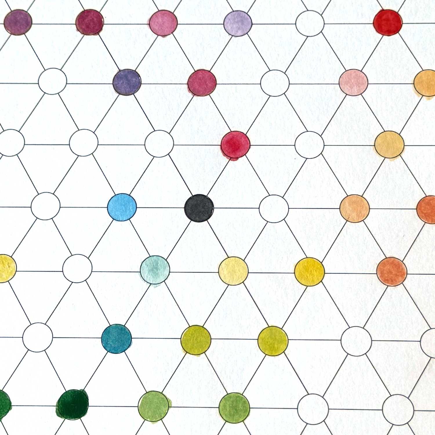
As Fate would have it, not only were the MaimeriBlu colors more aligned to Italy, but their color system appeared to mirror the foundations of color as set out in Göethe's work "Theory of Colors". Instead of using (deep) red, (dark) blue, and yellow for their primaries, MaimeriBlu chose to use magenta, cyan (azzuro), and yellow — mirroring Göethe.
This allowed me to mix a variety of lights and darks using only three colors, with the occasional ivory black thrown in so that I wouldn't constantly have to mix a gray with warmer tones. Under Göethe's model (which I will write about later), orange becomes a mixture of magenta and yellow, purple magenta and cyan, and green a combination of cyan and yellow. Both deep red and dark blue are recognized as combinations of primary and secondary colors, effectively rendering them tertiaries. This change, in both paints and process, has opened up a whole new world of color for me, allowing me to mix my own rich browns and earth tones without having to carry around a collection of tubes.
Only after experimenting for over a year am I finally "comfortable with color" — but I no longer need to rely on (or worry about running out of) pre-mixed paints!