Welcome!
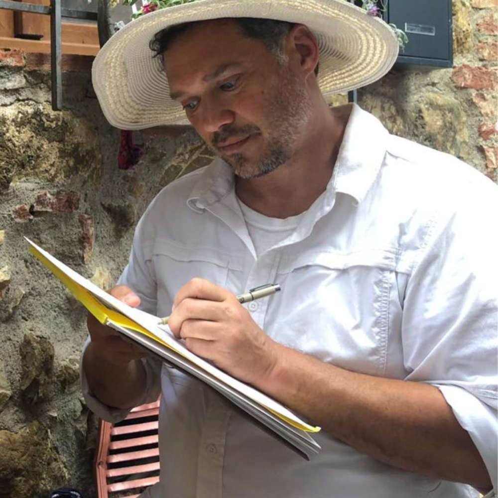
I am an artist with over 30 years professional experience in graphic design and visual communication for both online and in print. As a working artist, I am also available for commissions in pen and ink with watercolor. Reach out to me directly through my contact page or clicking the button below.
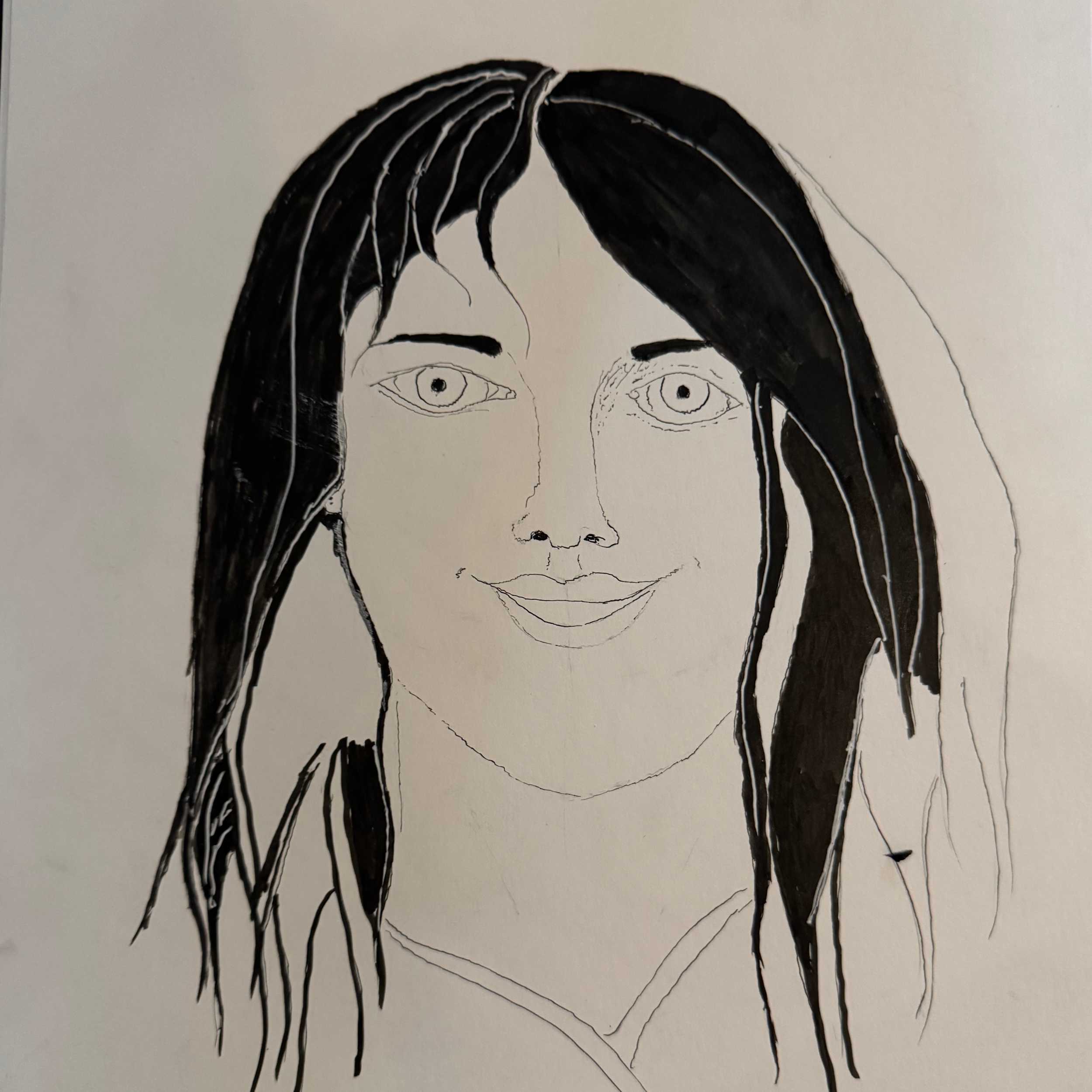
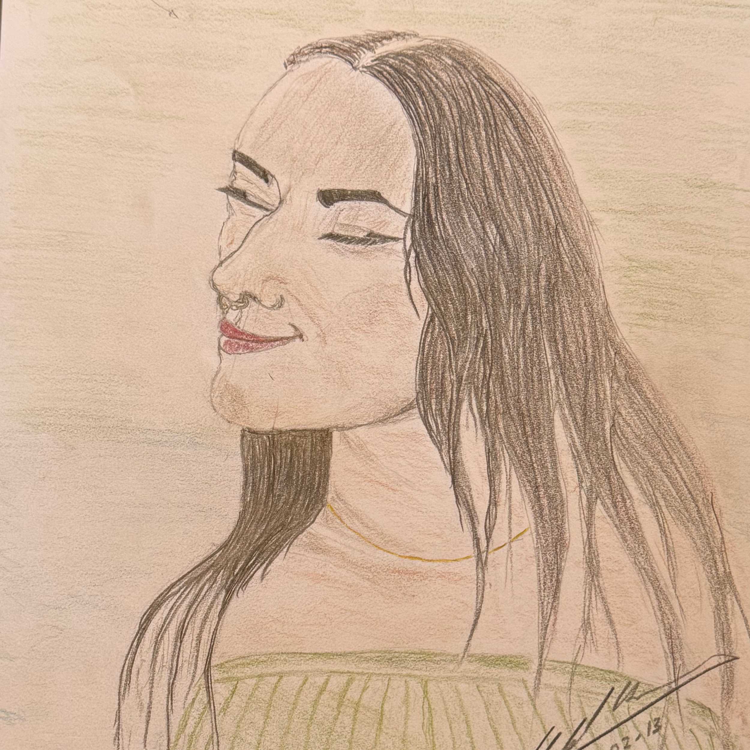
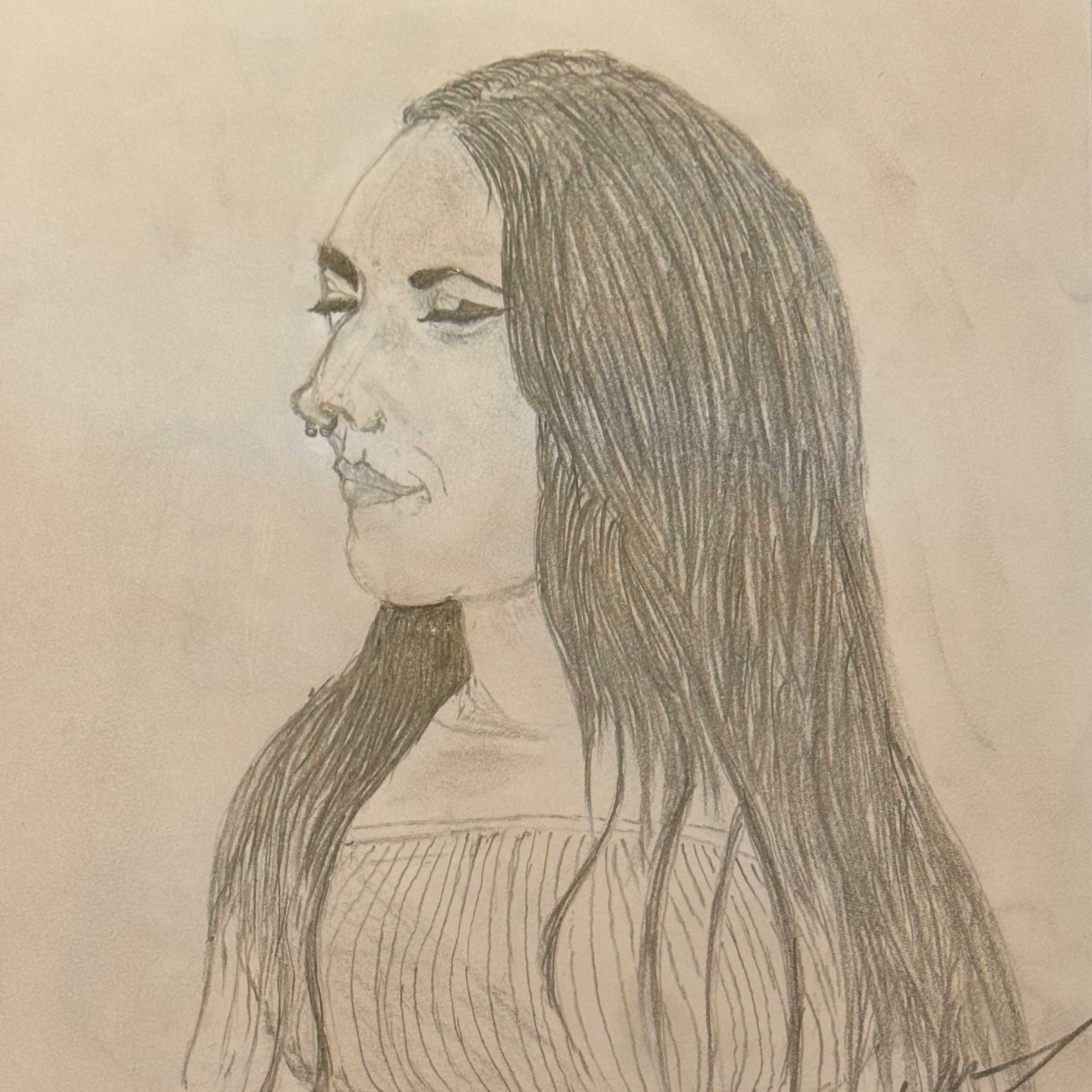
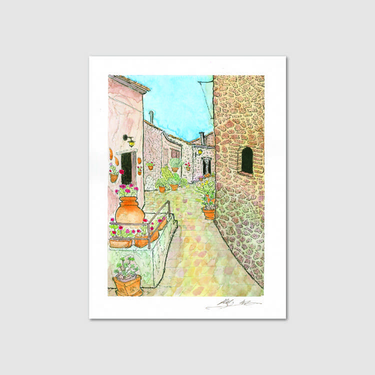
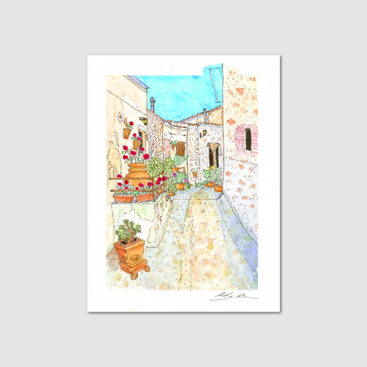
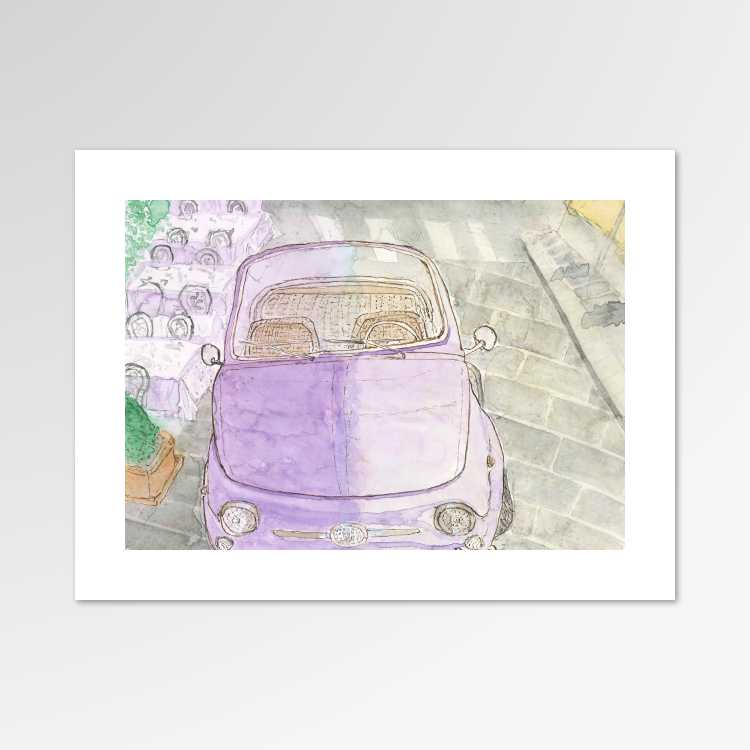
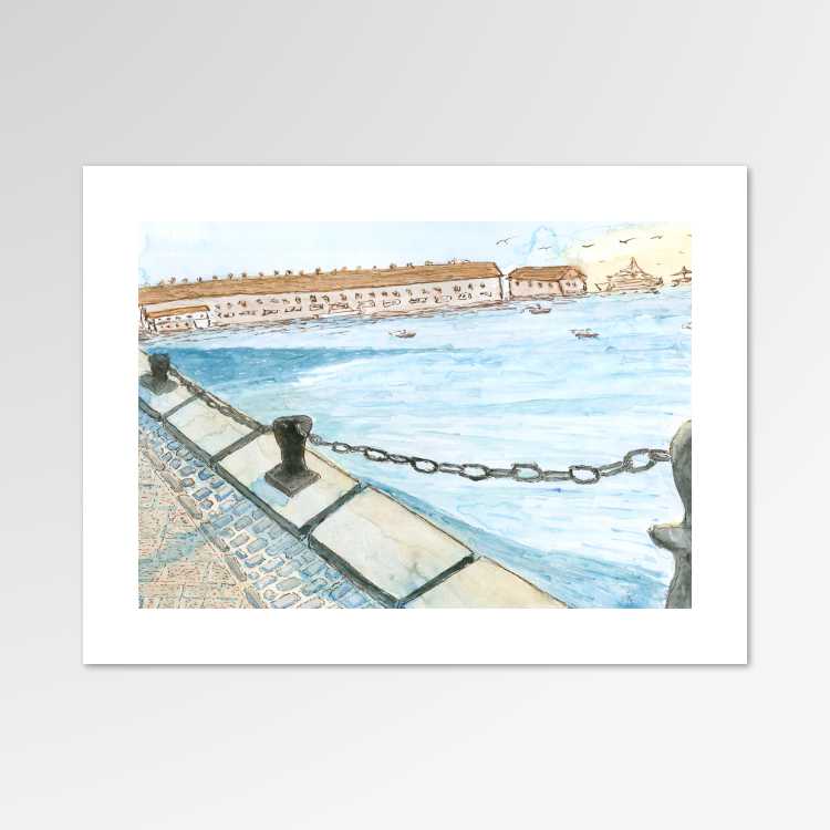
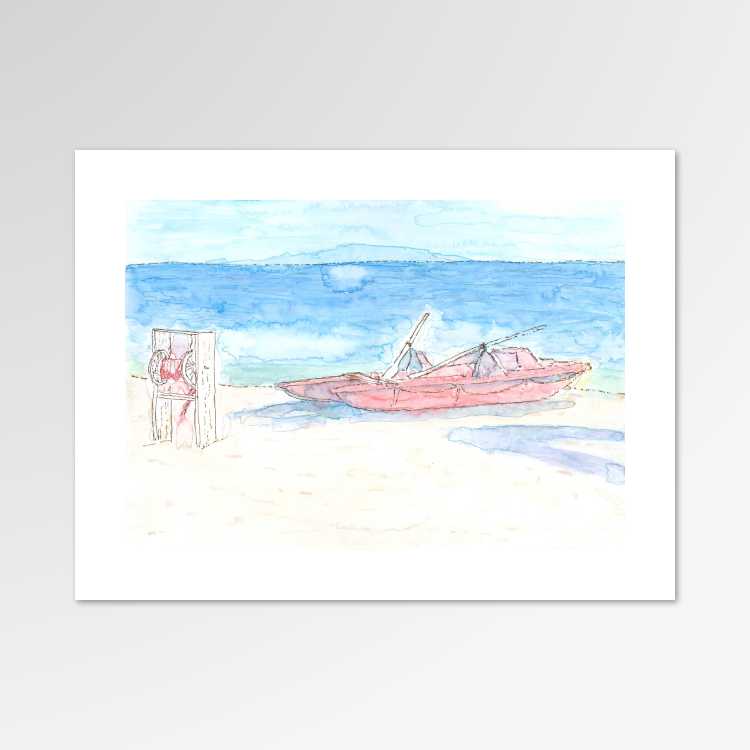
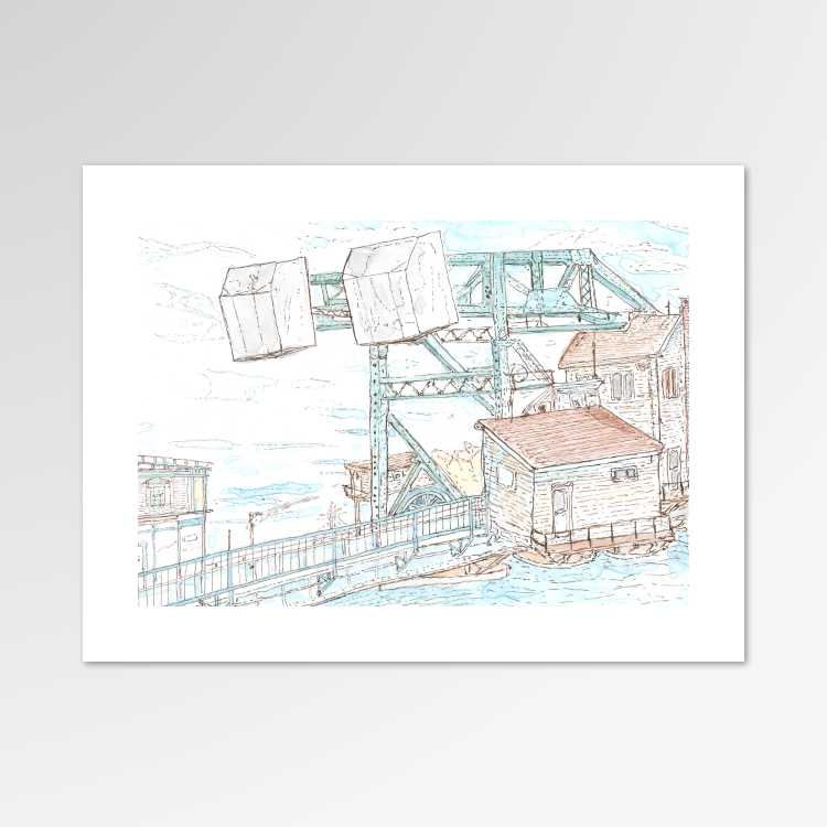
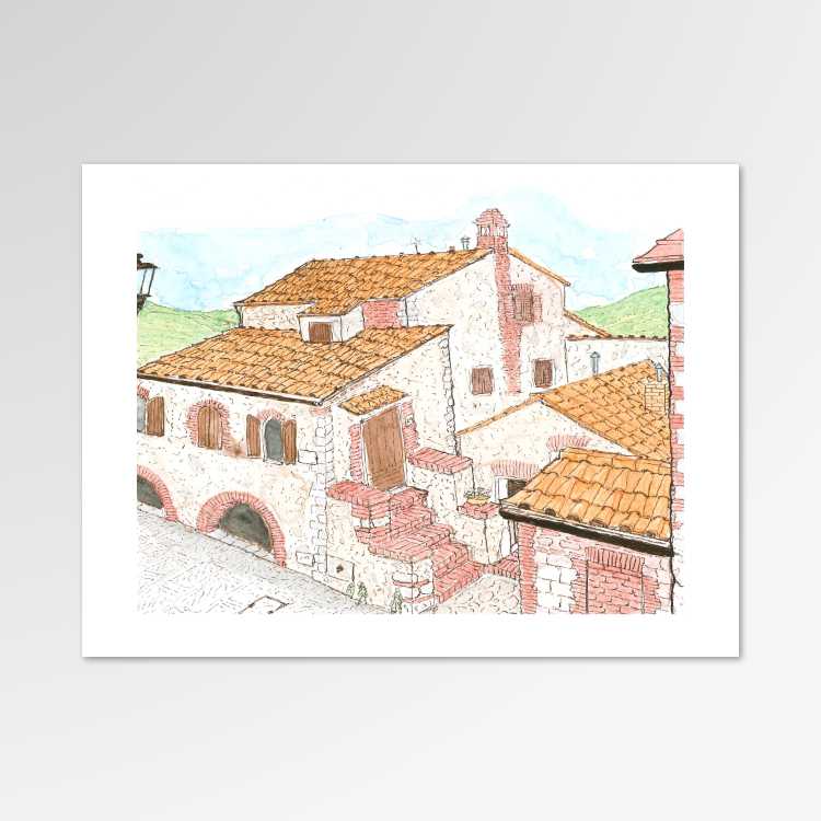
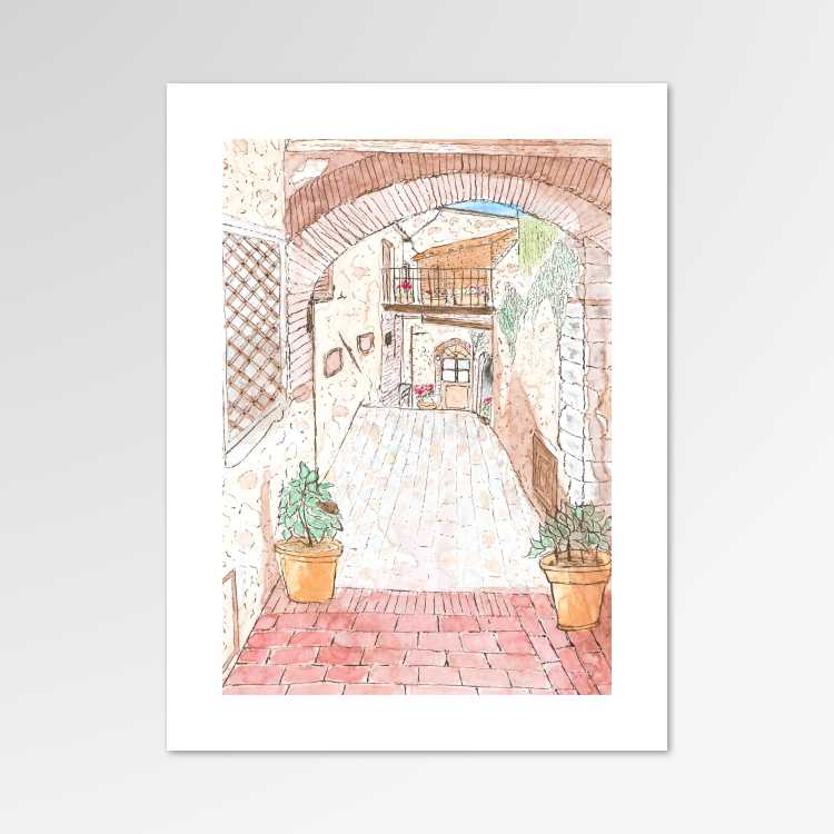
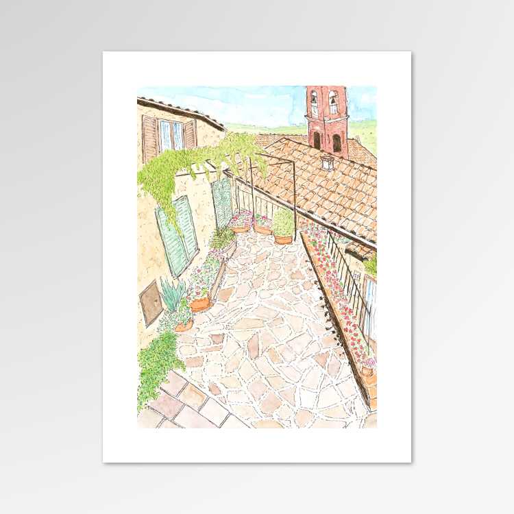
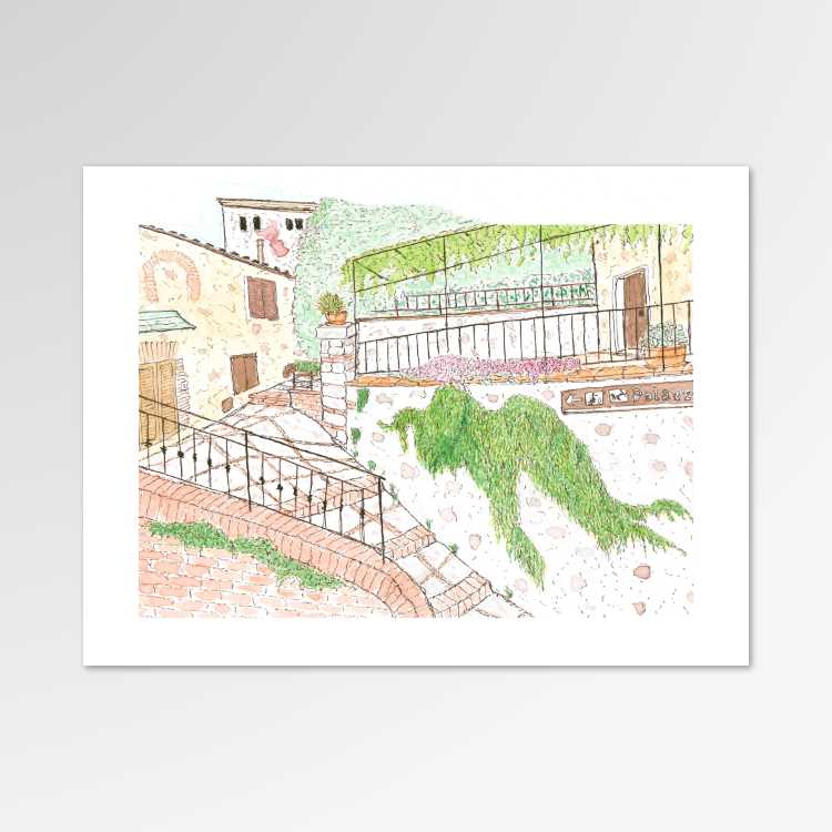
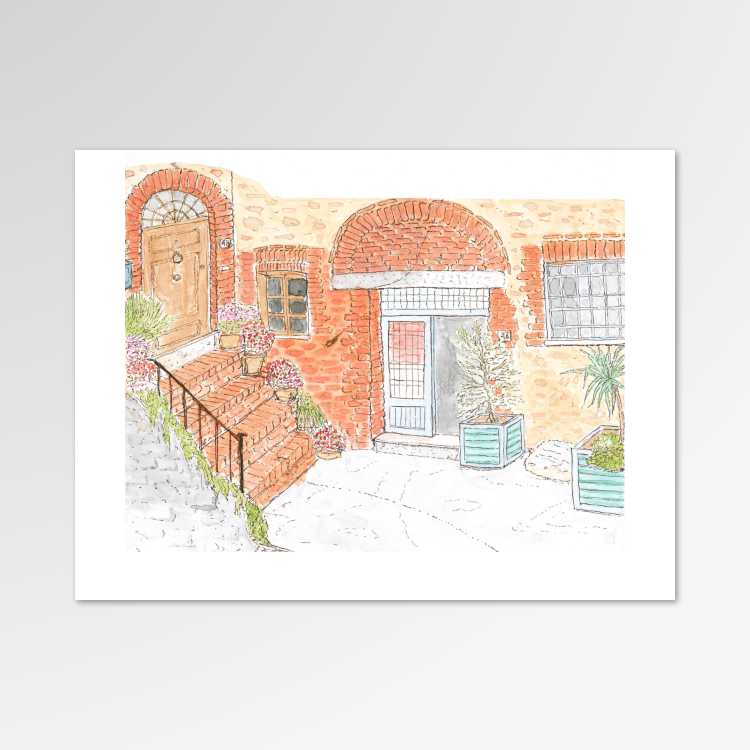
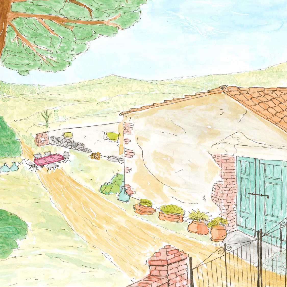
Featured Artwork
A selection of some of my latest artwork inspired by the people, pets, and places in my life.
News & Events
Every now and again, in between sketching and projects,
I take the time to write about current news and events. Click for details.
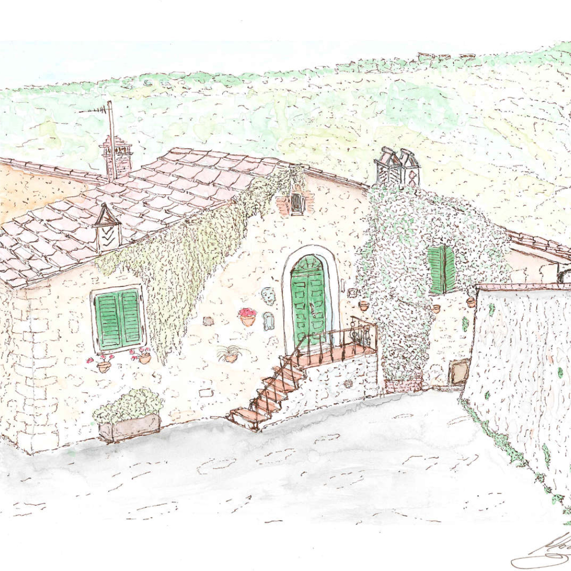
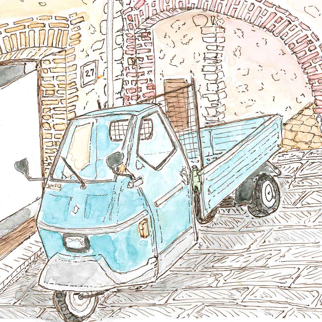
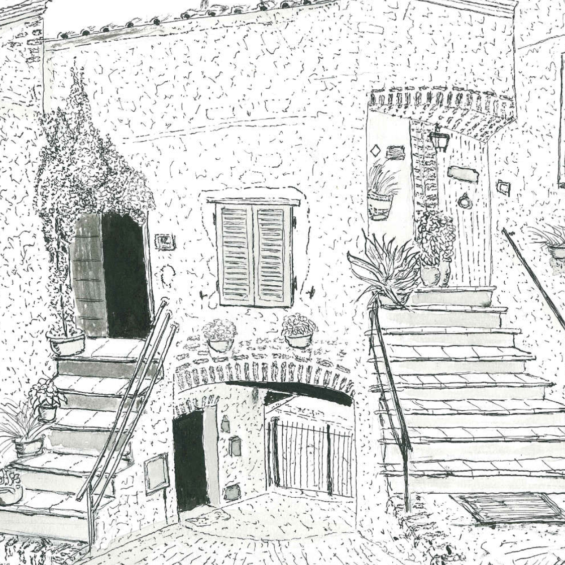
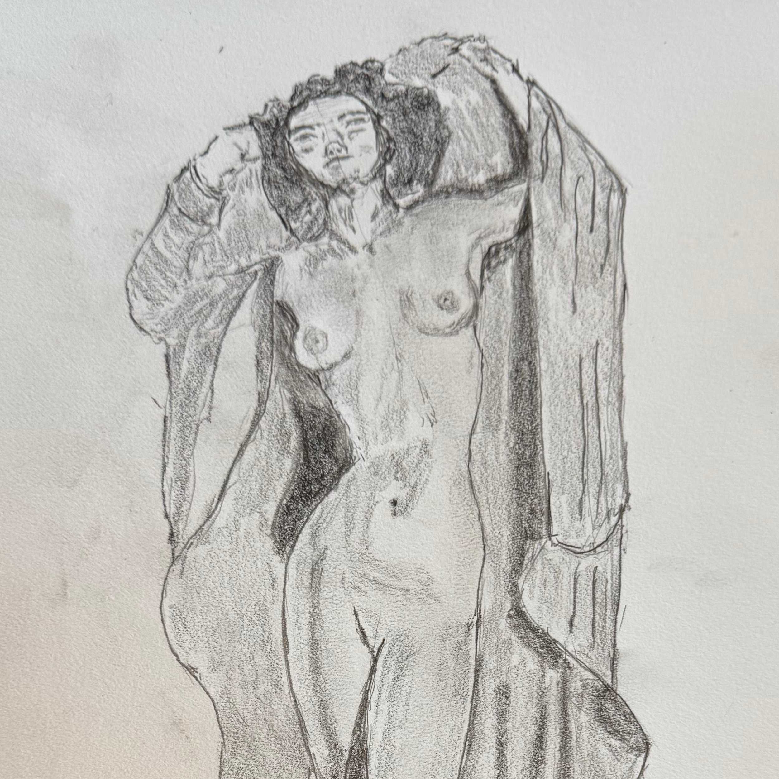
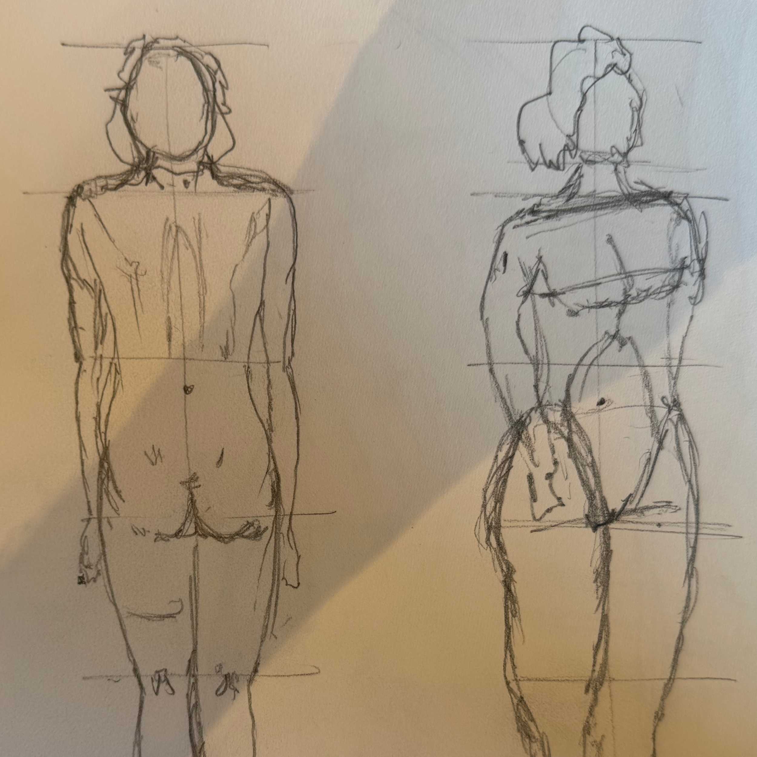
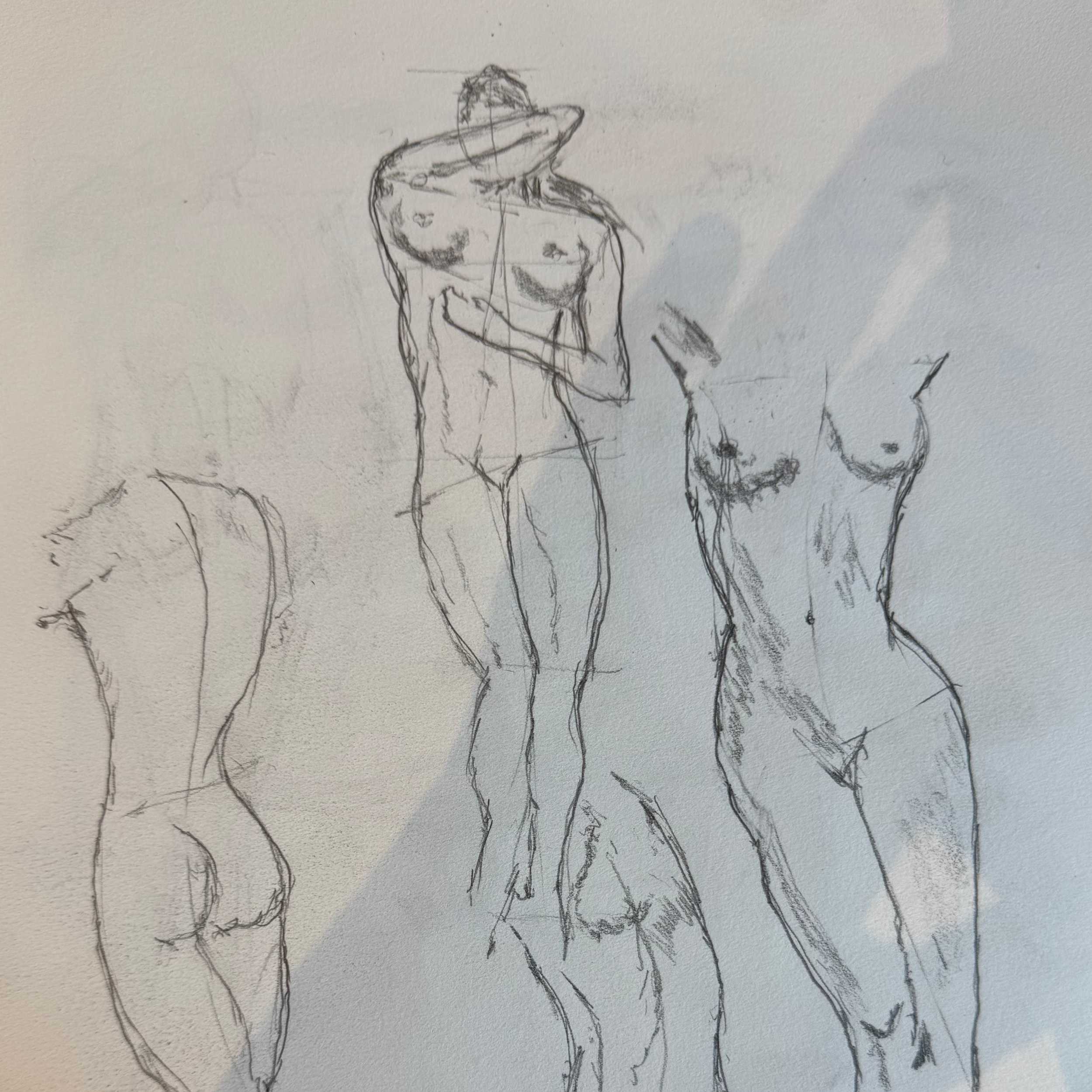
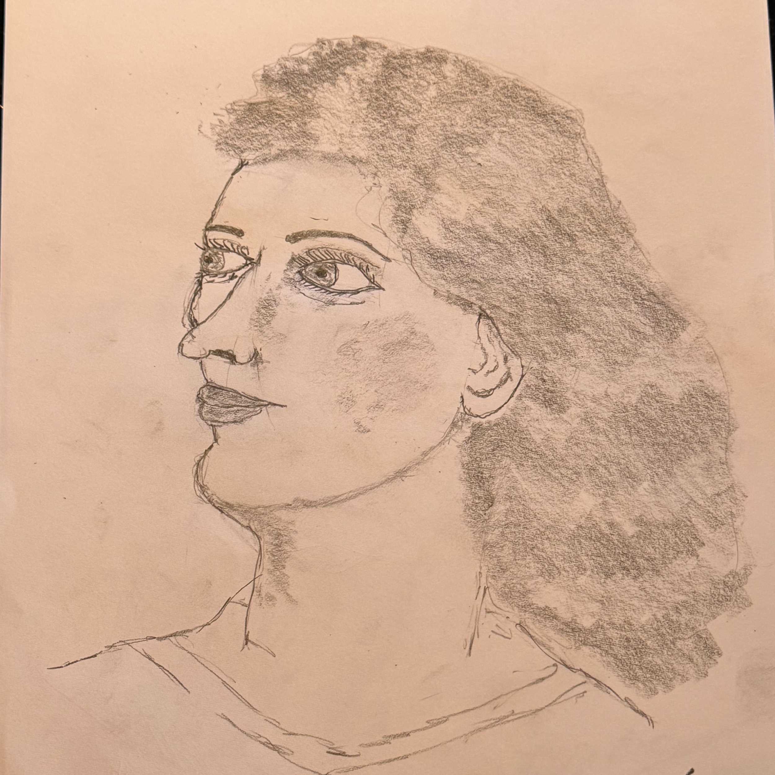
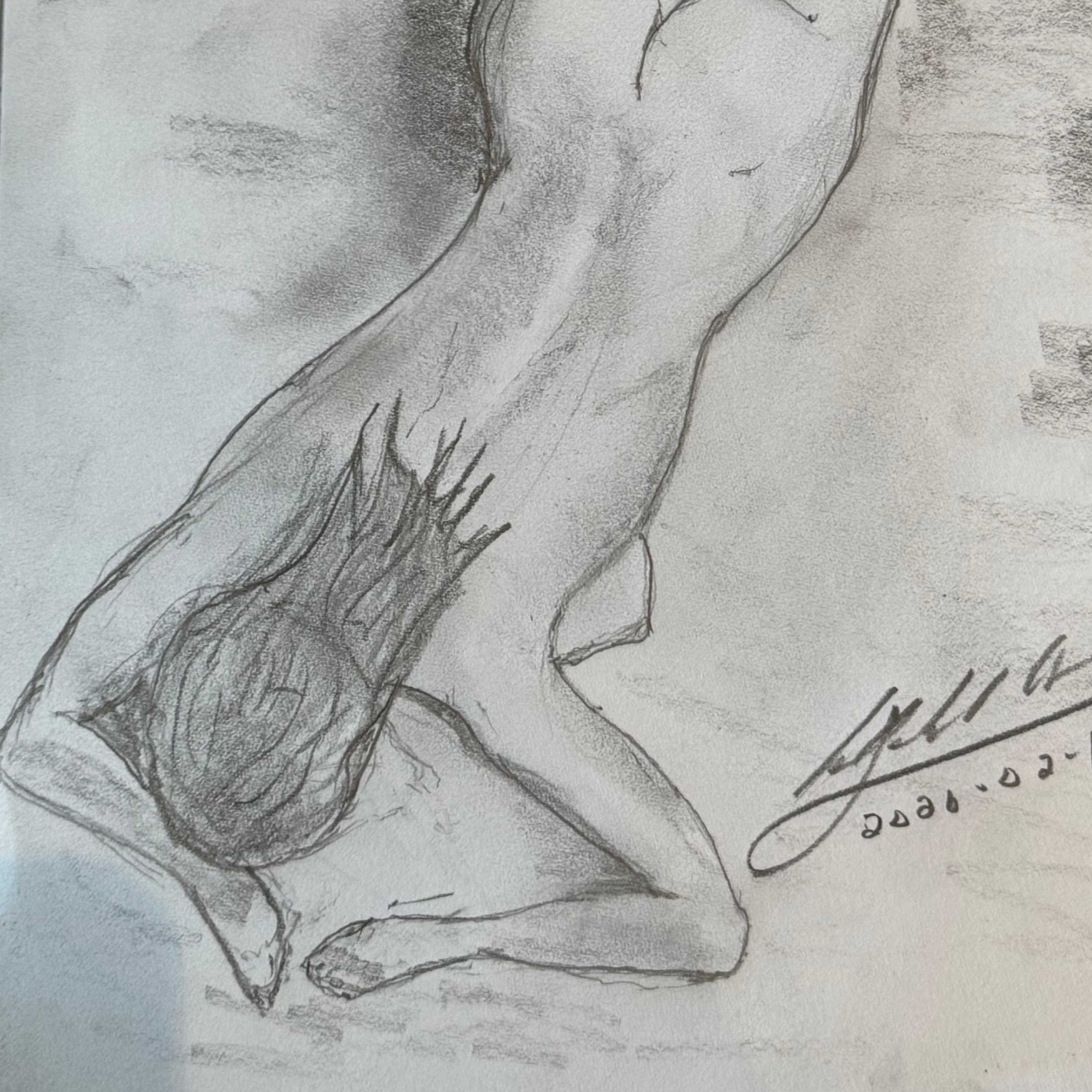
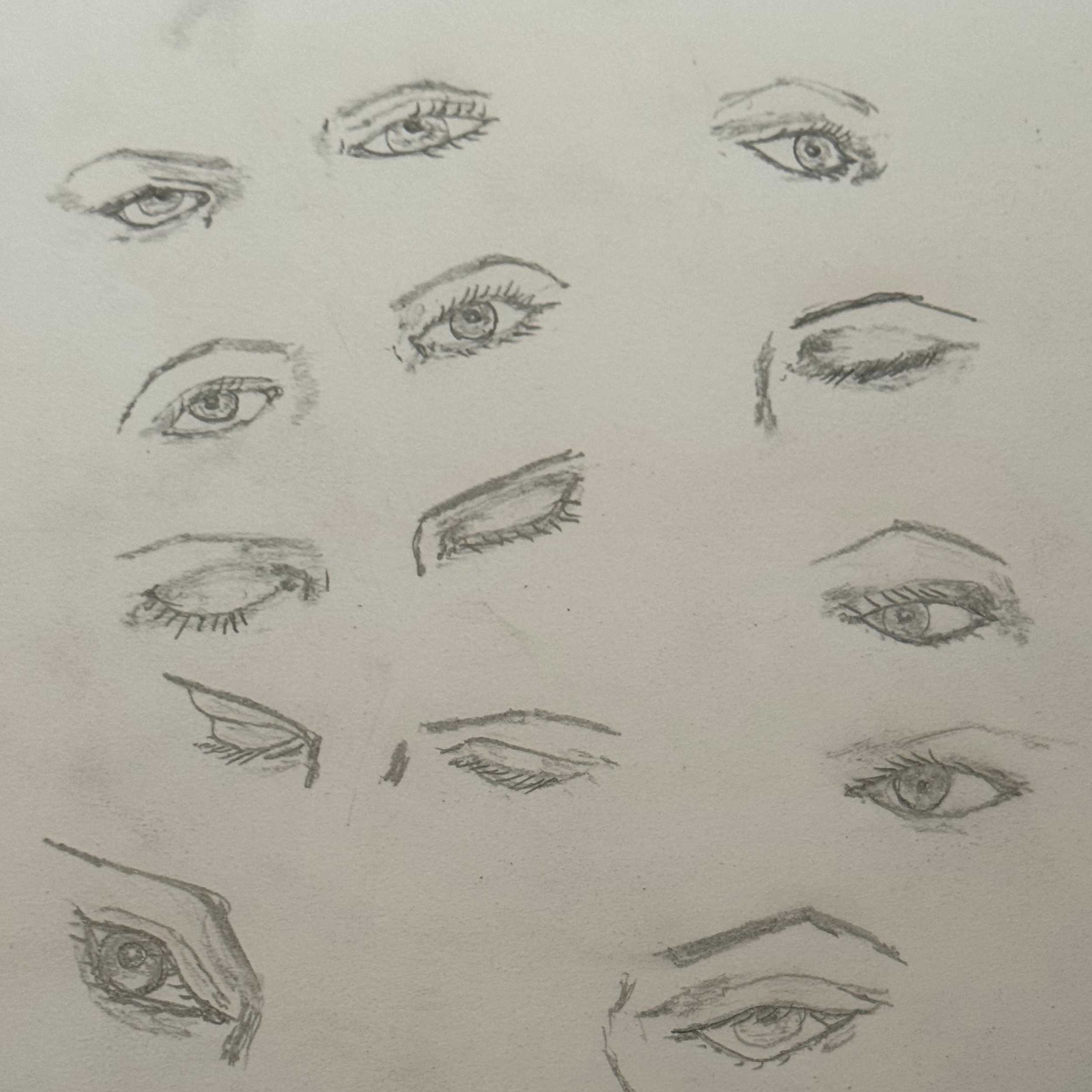
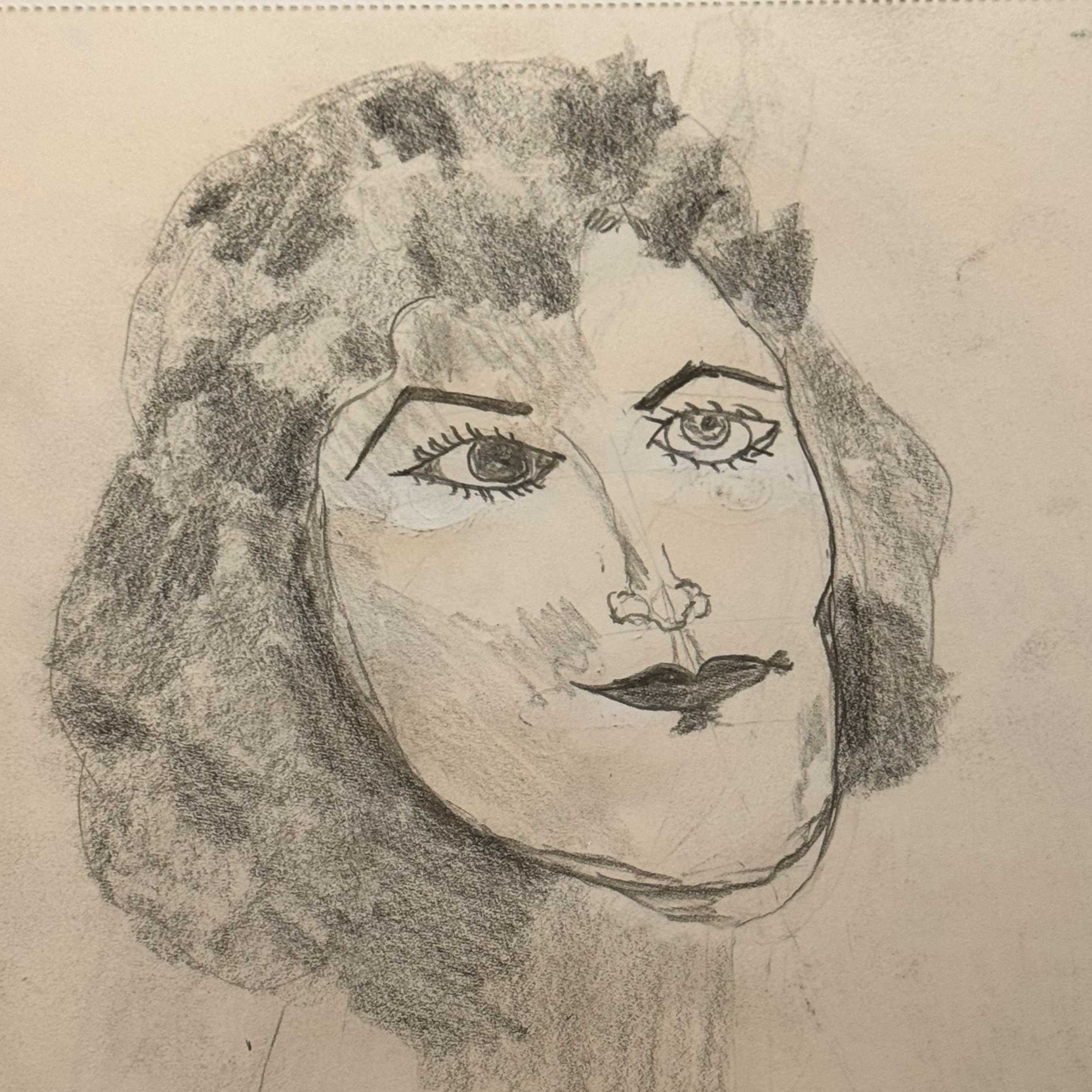
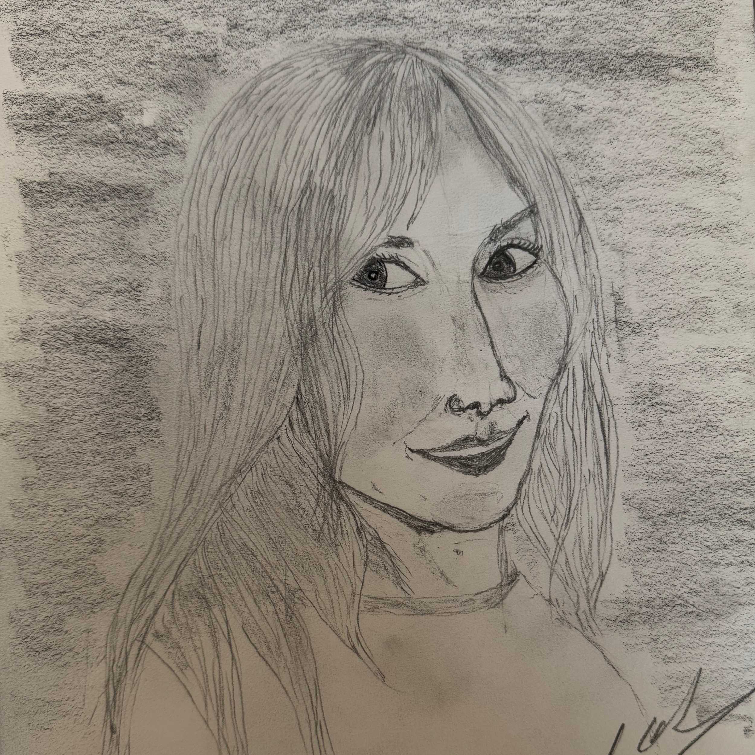
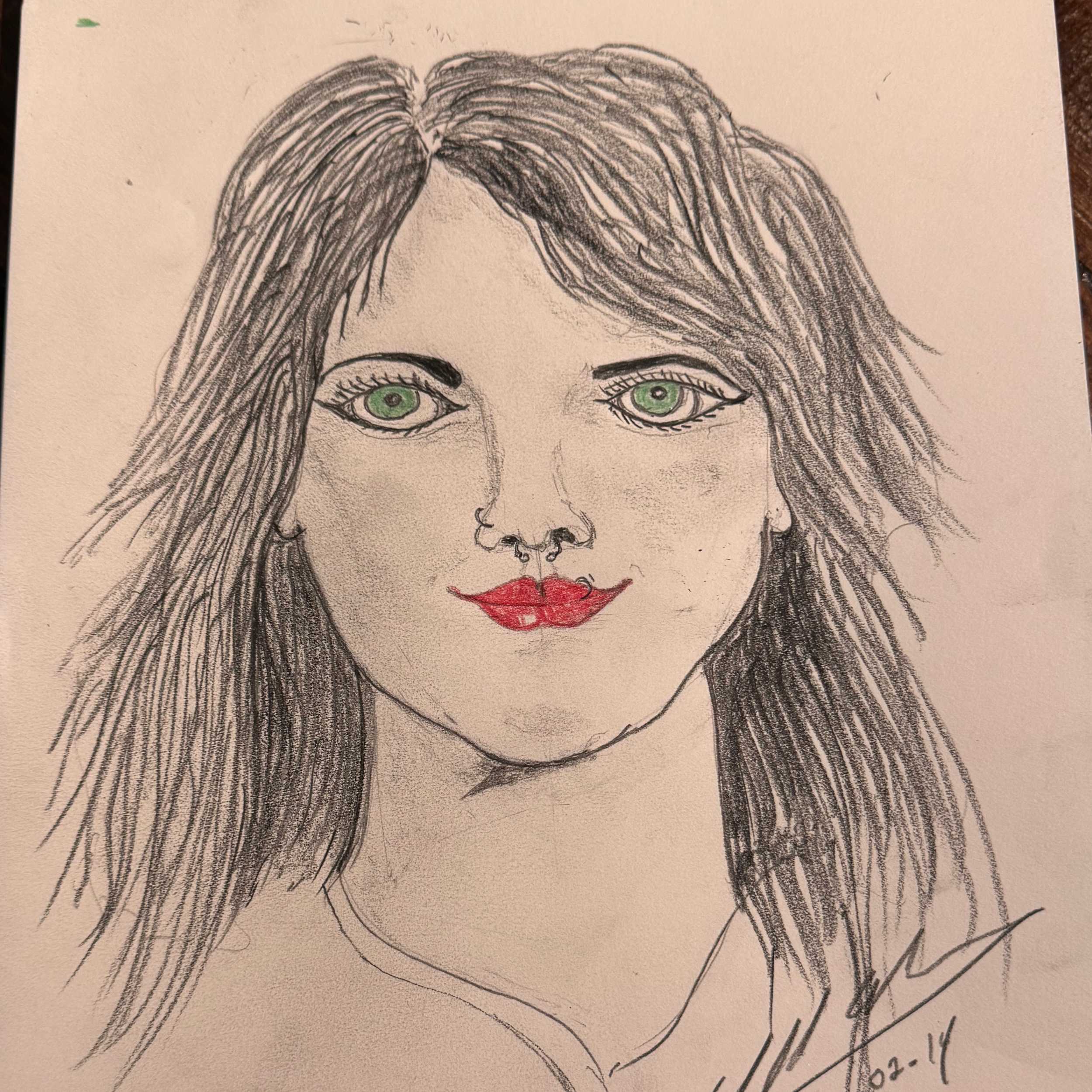
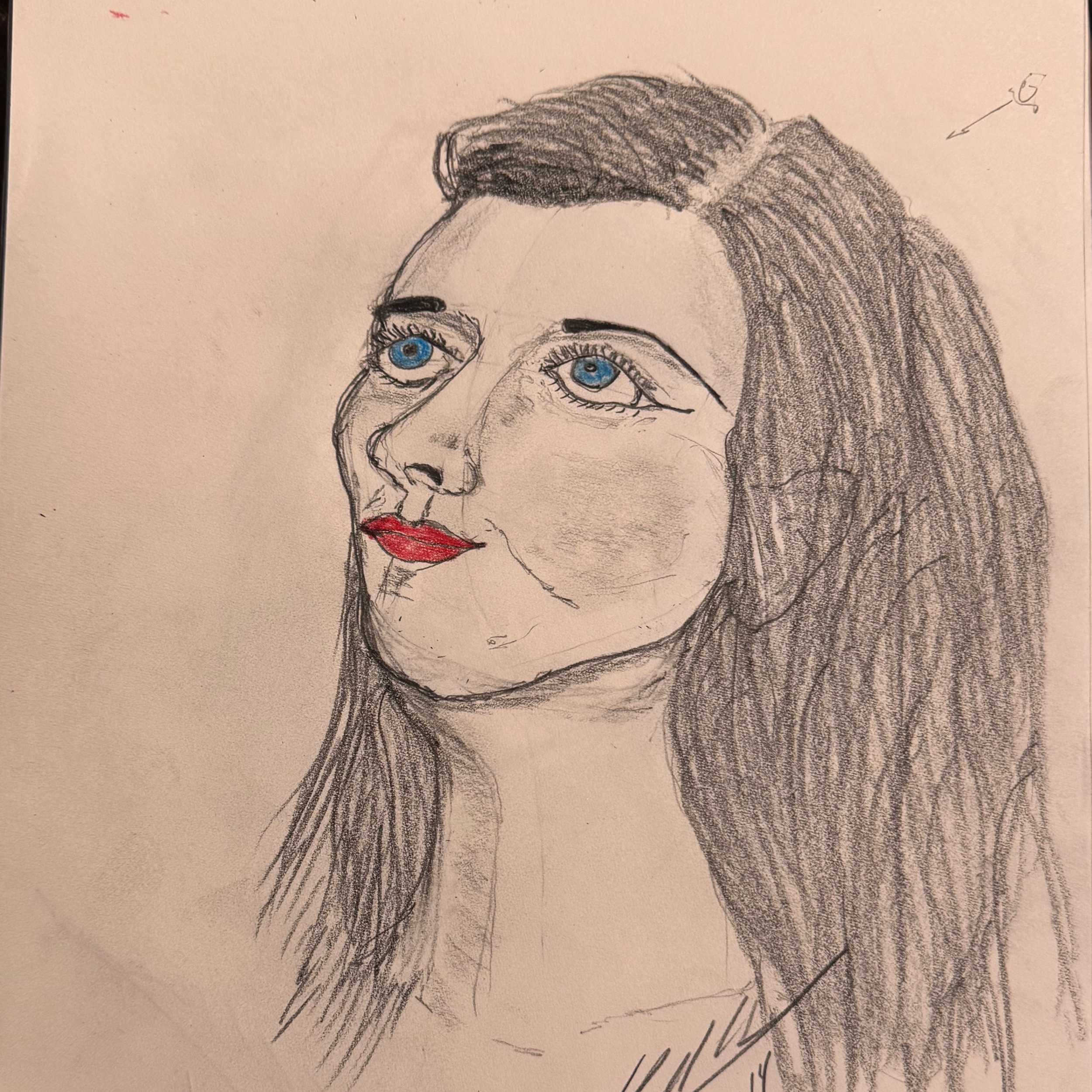
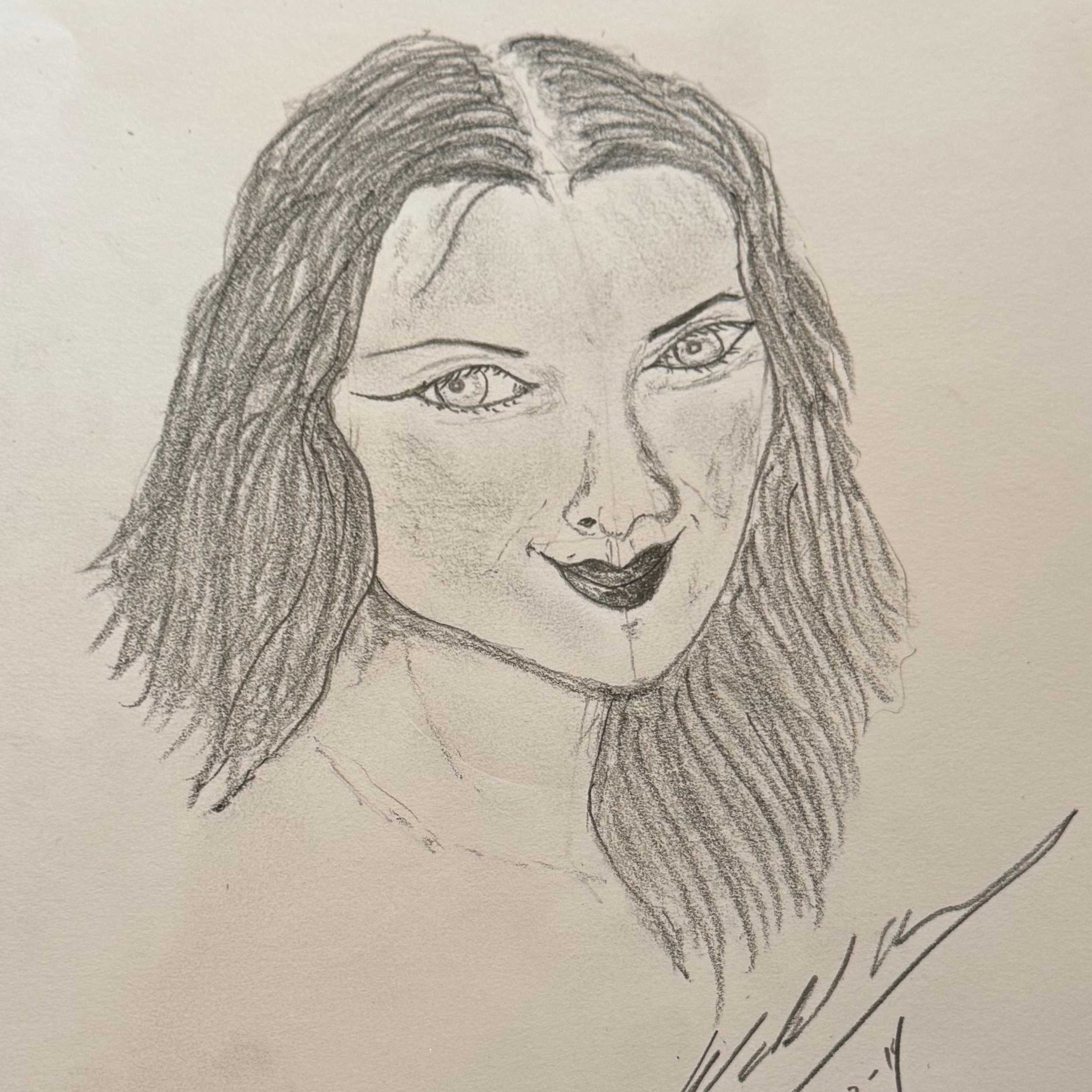
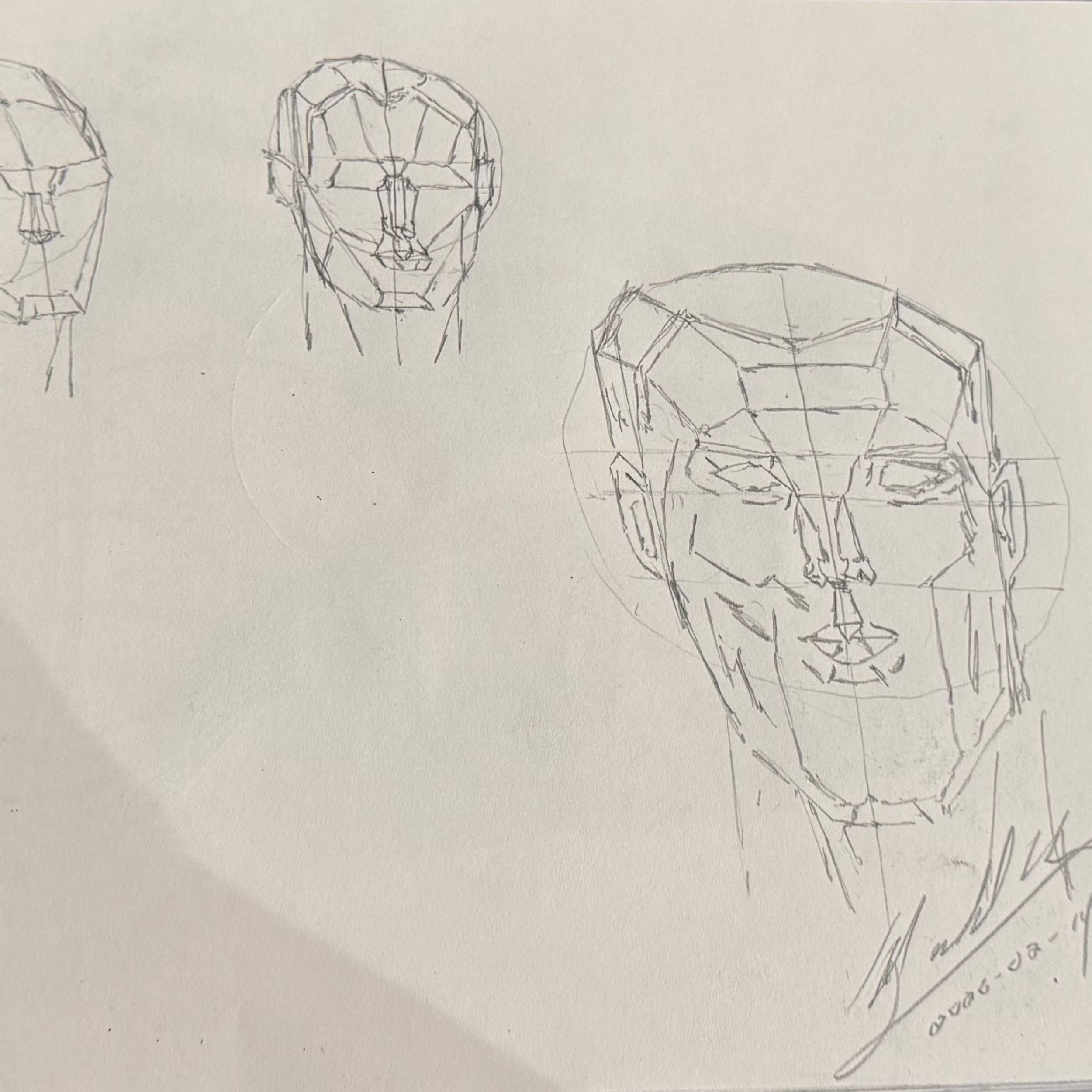
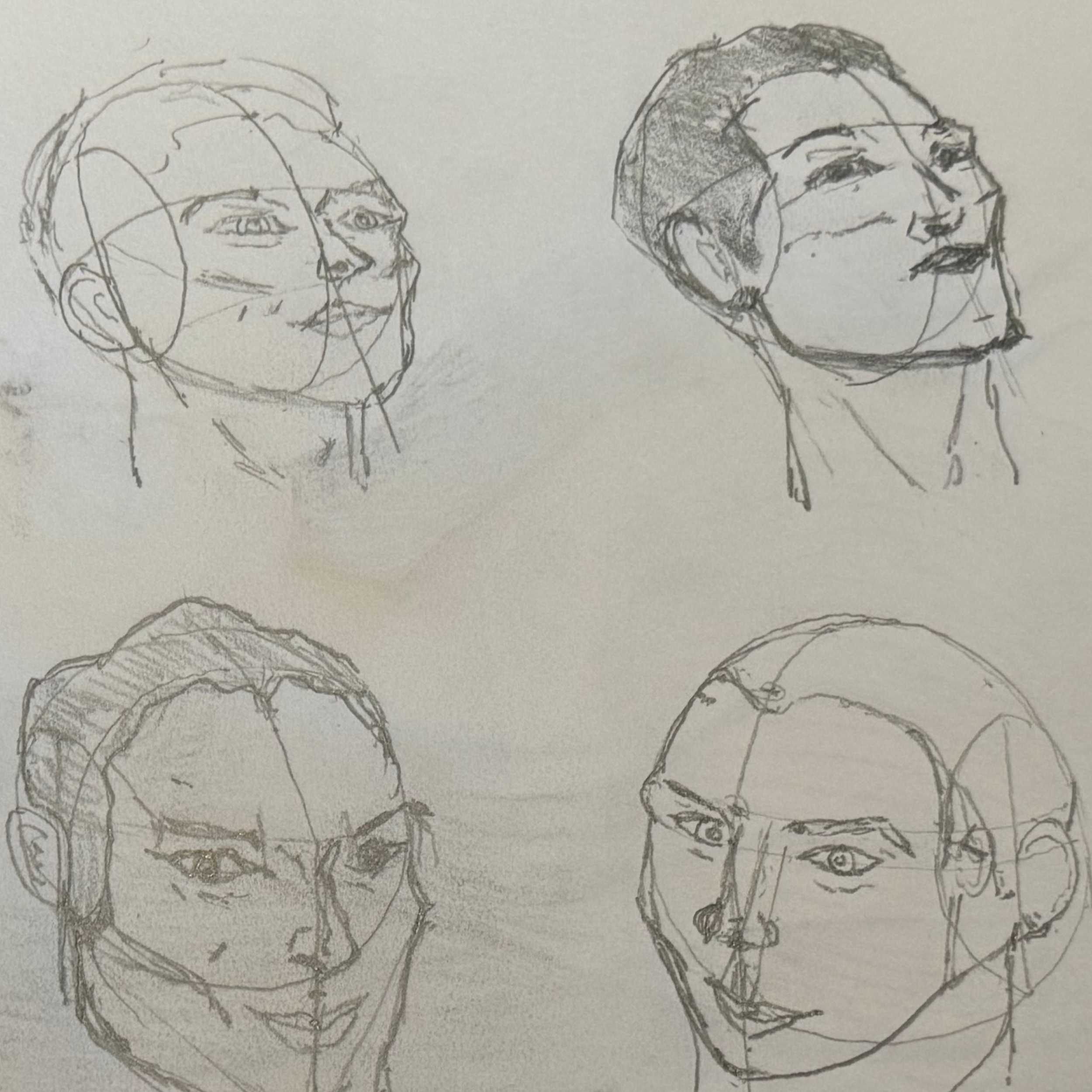
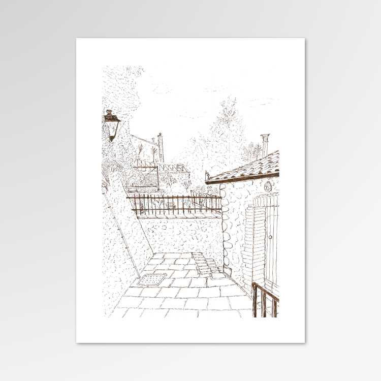
Recent Sketches
As a visual communicator, almost everything that I do begins with a simple sketch.
My most recent sketches are featured here. Click to view details.